Open Source Software Needs Visual Designers

Open source software is flourishing in terms of code. The interface design aspects have improved dramatically in the last few years. There has also been improvements in the aesthetics and visual design aspects of many prominent open-source projects. Firefox and Thunderbird are getting to be better looking than any proprietary app I know of. The BlueCurve theme by Garrett LeSage, formerly of RedHat, was a dramatic improvement for the overall look and feel of desktop Linux.

That said, there is a both a great need and a great opportunity for visual designers in the Linux desktop world. The Gnome and KDE desktop environments are themeable, and have plenty of themes available. However, like with Firefox, it’s the default theme that matters to me, and to the majority of people using the software.

I get the impression that many interface and visual designers have pledged allegiance to Mac OS X, or are living with the majority (understandably) in the world of Microsoft Windows. Come and help us!

There opportunities are significant. Right now, for example, Gnome is debating an updated default theme and RedHat has several full-time positions for visual designers in Massachusetts to work on the RedHat desktop.

Garrett LeSage, in his two years at RedHat, made a dramatic impact on the visual aspects of the Linux desktop with his BlueCurve theme for Gnome and KDE. Garrett has left RedHat, and they need people to take up where he left off.

You’ll often hear that Linux “isn’t ready for the desktop”. Maybe, maybe not. However, it won’t ever be ready if people don’t use it and contribute it (which they are doing, in great numbers).

Are you a designer that thinks Apple and Microsoft are stupid for not hiring you to improve their interfaces? Go work for RedHat, help out with the default theme Gnome.


New Default Theme Coming to Firefox 0.9

The crusade to make the world a more beautiful place inches forward. The Mozilla Visual Identity Team is happy to see the preview of a new default theme for Firefox, which will be included in the next release (0.9 – in the next couple of weeks).

Winstripe Theme Preview

The new theme was designed by Kevin Gerich and Stephen Horlander, the dynamic duo behind Pinstripe, the default Firefox theme on Mac OS X.

The new theme, called Winstripe (“Pinstripe” and “Windows” – get it?), aims to bring more polish and consistency to the Firefox interface. While it is based on the original artwork behind the Mac Pinstripe theme, it has been heavily reworked to blend in nicely with the Windows look and feel.

There will inevitably be a lot of feedback by those who loved the previous theme (called Qute), and might not like the new theme. Constructive feedback is appreciated, but “I hate it” doesn’t count as constructive feedback.

We realize that the new theme doesn’t blend perfectly with the Gnome / Linux interface, and we do hope to make improvements in that regard. That said, we find that Winstripe does work relatively well in Gnome for the time being. All kinds of good work is going on to make Firefox look and feel better in Gnome. Also, the Winstripe theme was rushed in to make it into the 0.9 release, so you will see improvements and refinements over the coming months.

If you aren’t a fan of the new look, give it time. Wait until the new release and try it out for a few days. See how you feel then. If you still don’t like it, you can always install the previous theme.

People tend to get very attached to the look and feel of an application, especially when it is an open-source application. I get the impression from some of the early reaction that people feel like we went into their living room and painted the walls.

I can understand this reaction, but there are a few things to keep in mind:

  • At the rate that Firefox is growing, there will be thousands (hundreds of thousands?) of people who use the 0.9 even more, the 1.0 releases as their first introduction to Firefox. They won’t have any attachment or familiarity with any previous default themes.
  • We see familiarity as quality. People are used to the previous theme and anything different will take a bit of getting used to. Give it time – reserve judgment until you’ve used it for a week.
  • We’re not trying to create great art here – we’re trying to create a clear, simple, elegant, and unobtrusive set of toolbar icons that are easy to understand and don’t get in the way.

Great work Kevin and Stephen.


Gnome Outliner: A Project is Born

Wow. Earlier this week, I posted a draft spec for, Gnome Outliner, a project I hoped to see developed. The response has been remarkable. Only four days later, there is a beggings of implementations in Java, Python, and C. It looks like, as I had hoped, I’m not the only one who would like to have a nice outliner for Gnome.

We have create a project on SourceForge to act as a home for the project. This will provide a bug database, patch tracker, CVS, and mailing list. So, if you are interested, please sign up on the mailing list (gnomeoutliner-devel) and get involved.

Thanks for all the great feedback.


Gnome Outliner: A Proposed Application

Gnome Outliner Interface Mockup

Since I’m now using Gnome as my primary desktop environment on Linux, I find myself wishing I had a simple outlining application along the lines of OmniOutliner. However, there doesn’t appear to be such a thing for Gnome (despite some old/abandoned projects).

Unfortunately, my limited skill set does not include the skill necessary to create such an application. So, instead of coding, I’ve started a draft of a specification for an application-to-be: Gnome Outliner. I’ve written this in hopes of generating developer interest to create such an application.

I’ve written up the idea and done a basic mock-up of the interface. Please let me know if you have any interest in the project.

UPDATE: There is now a project for this on SourceForge: Gnome Outliner.


George Orwell would use Firefox

Firefox with Firebird Shadow

When the Mozilla Foundation announced the name change for their web browser from Firebird to Firefox, there was a predictable response of skepticism. It was the second name change and people were understandably skeptical that the name would continue to change.

Even though the Mozilla Foundation was clear that Firefox was indeed the final name and was subject to a significant amount of scrutiny to avoid any future pitfalls with the name (trademarks, etc.), people still felt the need to chime in with suggestions.

And no, Thunderbird will not be called ThunderFox. Ever.

All of this was something of a tempest in a teapot – with the world of developers and webloggers (each of us a marketing expert) with an opinion (see the Slashdot thread – or don’t). Fortunately though, the final name change took place just before Firefox began its foray into the mainstream.

As the good Mozilla Foundation folks predicted, there was a small fire-storm of criticism (thunder-storm?), and then, only a few months later, Firefox has been generally accepted and the name changes forgotten.

While it’s not on the scale of the great Orwellian WWF-to-WWE switch, our own little Orwellian name switch has gone quite smoothly. Except for one hold-out office mate who insists on calling it it “firecat”, people have gotten comfortable with the new name, and with the rate of growth and exposure that will come with the 1.0 release this summer, a growing percentage of the Firefox users will never have even known the previous names.

Firefox is Firefox, Thunderbird is Thunderbird, and we all live happily ever after. Onward to 1.0!


Thoughts on Template Design

Doug Bowman and Adaptive Path have done great work with the Blogger redesign. The entire system feels simpler, more mature, and generally better. It is a pleasure to watch someone with such talent apply their craft.

Much has been and will be written about the new design. I agree with much of the positive response. Rather than adding to the chorus of praise (again, which I mostly agree with), I have some criticism of the templates.

Bowman brought in some heavy hitters of the web design world. Todd Dominey, Dave Shea, Jeffrey Zeldman, Dan Rubin, and Dan Cederholm all contributed templates that are freely available for Blogger sites.

While all of the new templates are stylish and well implemented, I found many of them to be lacking in the attributes fundamental to template design.

A good template is difficult to design. The designer must step back and imagine the many types of content that will be framed in their design. Some weblogs will consist of dozens of one or two-line posts per day. Others will have thousand-word essays. Others will consist mostly of photos. The templates will be filled with lots of different languages and many varied color schemes once customized.

Snapshot Sable Blogger template by Dave Shea

Several of the designs are deeply infused with the personal style of the designer. While this may have been what they were asked to do, I don’t find it works well in template design.

Take, for example, the templates of the talented Dave Shea, Snapshot Sable and Snapshot Tequila. While Shea’s designs are sharp and attractive (granted, this is subjective), they include visual elements (a photo of a road and a subway map) that fight for attention with the writer’s own material.

TicTac Blogger template by Dan Cederholm

Dan Cederholm, who has a strong esthetic that I admire, produced two templates: TicTac and TicTac Blue. Both templates look great. Judging purely on their visual style, these are my two favourite of the new Blogger templates. However, I find Cederholm’s personal style is almost too strong. Rather than seeing my Blogger site, I see a Cederholm template with my writing. Granted, this will not be an issue for most people who are not familiar with the web design weblogging community.

Minima Blogger template by Doug Bowman

Of the new templates, Doug Bowman’s own “Minima” (Minima, Minima Black, Minima Blue, Minima Ochre) and “Rounders” (Rounders, Rounders 2, Rounders 3 are a good example of quality template design. The templates are stylish, simple, and attractive, yet they do not overpower the writer’s own content. They are also relatively easily customizable for color variations.

Scribe Blogger template by Todd Dominey

Another good example of quality template design is Todd Dominey’s template, Scribe. Dominey writes about the design:

So the creative challenge, for me anyhow, was to develop a template design that had personality and a general creative concept, but (like the old Blogger templates) wasn’t so visually overbearing that it distracted readers from the real content of the page.

This design shows that a unique and strong visual concept can be executed in such a way that leaves room for flexible content and does not impose itself too much on the writing and content of the site.

Given these criticisms, I extend my congratulations to Doug Bowman and all the talented people who worked on the new Blogger design and template set. Good work to all.


The Rise of Interface Elegance in Open Source Software

Open Source software is regularly criticized, often fairly, for lacking in ease-of-use and polish. When a developer wants a new feature – he can add it to the software, and if it gets checked-in by the project owners, it will be there for all to use. The obvious fault with this model is the now well known scourge of “creeping featuritis” – when too many features and options begin to overwhelm and overshadow the core functionality of the software.

The Mozilla browser and suite were a high-profile example of the ills of featuritis. While the software did everything you could possibly want it to, people still seemed to prefer other software packages that did less.

In a well run software project (several of which I fancy myself a part of), any additional feature must be proved valuable before it is incorporated. Even if a patch is already written to add a new feature, there are plenty of reasons not to accept it. More code means more potential bugs and more management. Additional user interface features can detract from other more important features.

Learning to Say “No”

One of the most important acts of a software project manager is to say “no”. No, this patch introduces more code than it should. No, this feature will confuse more people than it will help. No, you’re ugly and stupid (sometimes the manager has a bad day).

The open source software model has dealt with the importance of saying “no” quite well in the realm of code and patches. Projects have a limited set of people with the power to commit code to the project. Anyone can submit a patch, but only the anointed few can accept it. These anointed few are usually determined by right of having founded the project, inherited the project from the founder, or through perceived merit. For more on the issue of project ownership in free software, see Eric Raymond’s Homesteading the Noosphere.

When submitted code isn’t up to snuff, it isn’t accepted (ideally). The practice of saying “no” to patches in open source software is understood and accepted. Now, some projects seem to be learning the value of saying no to ideas and features that will negatively affect the interface and experience of using the software.

Living Examples: Firefox
Firefox icon
The Firefox icon, rendered by Jon Hicks

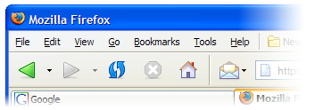
In discussion about the usability of open source software, the Firefox web browser is sometimes cited as an exception[1]. Out from under the girth of the Mozilla project, this small and simple browser emerged to become one of the more popular open source products and projects. The developers of Firefox leveraged the long and proud history of saying “no” to code patches and applied it to the interface and functionality as well.

The resulting browser provides a better browsing experience than it’s ancestor, Mozilla Navigator, despite having far fewer features and functions. Smart default settings and an overall better understanding of the experience of using the application by the developers helped make it better for everyone.

Living Examples: Gnome and the Spatial Nautilus
Spatial Nautilus screenshot from ArsTechnica
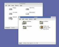
Spatial Nautilus isn’t really much to look at – you really have to use it to understand it. Screenshot from ArsTechnica.

If you think “Gnome and the Spatial Nautilus” sounds like a line from a novel that Douglas Adams and J.R.R. Tolkien might be collaborating on in the afterlife, please bear with me. Gnome is a group of projects that provide a desktop environment on Linux. Nautilus is the name of the file manager in Gnome, like Explorer in Windows and Finder on the Mac.

The “spatial” browsing metaphor a concept for browsing and managing files and directories of which the details are not important for this essay (to learn more about spatial browsing, see John Siracusa’s seminal article, About the Finder…). Suffice to say, the Gnome project has implemented spatial browsing in Nautilus in their latest release, and a lot of people really don’t like it.

Using the spatial browsing metaphor can take some getting used to, and many people who are used to another metaphor (or no solid metaphor at all) are understandably quite resistant to this new model. A fundamental and controversial shift like this is one I would not have expected an open source project to be able to pull off. While a closed corporation has a hierarchy of power, where one person can make a decision for all, consequences be damned, I was skeptical that such a move could happen in the looser structure of the Gnome project.

I was wrong. The developers of Nautilus debated and then declared their bold intent to “go spatial”. There has been much support, and much resistance. However, regardless of whether they were right (which will likely be proven over time), they deserve credit for making such a strong, clear, and decisive move.

Living Examples: Hunting for Preferences in Gaim
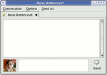
Gaim screenshot
The Gaim messaging client is starting to get simpler with each release with a planned simplification of the preferences.

A third and final example of this pattern of interface elegance in open source software comes from a recent discussion on the development mailing list of the Gaim instant messaging client. Gaim is an open source messaging client that works with a variety of protocols (AIM/ICQ, MSN, Yahoo, Jabber, etc.).

Sean Egan, lead developer on the Gaim project, has posted his intent to dramatically simplify the “Preferences” in the application. He lists many preferences that can simply be replaced by a good default, and others that are just plain irrelevant. Rather than getting bigger and fancier with each release, the project seems to get simpler and more elegant.

Killing the Myth of the “Average User” and the “Power User”

Rather than aspiring to do everything imaginable, we are better off aspiring to do everything we might actually want our software to do in practice. While it may be that I’m attracted to projects that tend towards elegance in interface and design, I suspect that the examples I’ve cited here are not exceptions. Rather, I see them as part of a larger trend in open source software – one where simplicity and elegance in interface design is held in the same respect as elegance in code and engineering has been all along.

A kernel hacker, who we might all consider to be a “power user” may not be a power user when he just wants to burn a CD for his road trip. A database administrator, another typical “power user” may just want to chat with his friends, not perform an orchestra of preferences and settings in a chat application. We are all experts in some area of software and beginners in others (and our experience is constantly changing).

Rather than adding more and more features for the mythical “power user”, or swing to the other end of the spectrum and dumb-down the interface for the mythical “average user”, smart developers are learning that good defaults and elegant interface design makes software better for everyone to use, regardless of their level of experience.

  1. John Gruber cited Firefox and Camino as exceptional in their usability as open source projects in his critical reply to Eric Raymond’s essay, The Luxury of Ignorance. The reasons for the exceptional nature of Firefox and Camino are further discussed by Matthew Thomas.
 

New Artwork for the Mozilla Thunderbird Email Client

Thunderbird iconFollowing the updated artwork for the Mozilla Firefox browser, the Mozilla Visual Identity Team has finished new artwork for the Mozilla Thunderbird email client.

Again, the icon was based on sketches by Stephen DesRoches and ideas from the rest of the team and drawn by the talented Jon Hicks (get him something from his wishlist).

We may update the Firefox icon somewhat to better match the new Thunderbird icon. Great work Jon and the rest of the team.

As others on the design team post about the new icon, I’ll keep a running list of their posts here: