Panoramas from the Left Coast

While on a recent trip to San Francisco, I took about 400 photos with my digital camera. A few of these were adjacent shots intented to be stitched together with panoramic photo software.

All kinds of software packages are available to stitch photos together into panoramas. My friend Nathan recomended a package called Panorama Factory, and it is impressive. My camera (nothing high-end, it’s a 2MP Canon Digital Elph S330) includes a feature to help line up multiple shots for a panorama, but Panorama Factory is good enough that you don’t even need to use the camera aids (though I still did for the photos below).

These aren’t meant to be particularly good photos. As you can see by my photo gallery, I’m no photographer. However, I do manage to luck out and catch a few nice ones now and then (getting up at sun-rise always helps, as with this set from the North shore of Prince Edward Island). I thought I would post a few photos to show how easy it is to put together panoramas, to encourage others to try it out, and to point out the great software package I’ve been using (Panorama Factory).

Each of the files below are simple partial panoramas, but Panorama Factory is just as good with complete 360° panoramas. As I show below, it can export to flat images (JPEGs) or create QuickTime panoramas (it also exports to a few other proprietary panoramic formats).

Pacific Beach Panorama

A pitstop on the way from San Francisco to Monterey.
Pacific Ocean Panorama

One of the most beautiful landscapes I have ever seen (not really captured well here) – taken from the hills outside of San Francisco looking towards the Pacific ocean. As an added bonus, that’s the president of the internet on the right.
San Francisco Hills Panorama

A view of silicon valley from the hills – I’m not actually sure where we are at this point. That’s Stephen DesRoches on the right who was all about gettin’ the shots.
San Francisco Hills Panorama

Another shot from the same vantage point as the photo above. This one was with 3-times zoom.
 

Branding Mozilla: Towards Firefox 1.0

Firefox iconBack in October of 2003, I wrote an article with a series of criticisms and recommendations for the branding and visual identity of the Mozilla software projects. Partially, I suspect, due to my cheap and somewhat inaccurate use of the “2.0” version in the title of the article, it got quite a bit of attention. There was a Slashdot article about it, with loads of Slashdot-esque replies.

In open source software development, the usual reply to any requests, suggestions, or criticisms is the classic refrain: “Where’s the patch!?” This reply is a (sometimes) polite way of saying, if you don’t like it, fix it. That’s how open source software development works. Therein lies its beauty.

Since the recommendations in my article were not the kind of things that can be fixed with a software patch, I got the graphic design equivalent of a “where’s the patch” response. Bart Decrem from the Mozilla Foundation contacted me and asked if I would be interested in helping out with the branding work (i.e. “where’s the patch!?”). A few months later, I’m the lead of the Mozilla Visual Identity Team.

Our tasks is to improve the quality and consistency of the visual elements of the Mozilla products. Icons/logos, default themes, and other visual aspects of the software are all on our radar.

The team includes two of my co-workers at silverorange, Daniel Burka and Stephen DesRoches as well as other volunteers from a bunch of different time zones. Kevin Gerich and Steven Horlander have done the Mac OS X themes for Firefox and (soon) Thunderbird. They’re also working with Daniel on the default them on other platforms.

Our first major piece of work was to create a new logo and icon set for the Firefox browser, which was newly renamed (formerly Firebird).

Firefox logos

Jon Hicks did the illustration of what is now the new Firefox logo and icon. The form was based on an idea by Daniel Burka, and a sketch by Stephen Desroches. Other icons in a similar style will follow for Thunderbird and other appropriate locations.

Sketch and Rendering of the Firefox logo

Jon has made a great post about the design process on his weblog. I stole a few of the graphics from his post — thanks/sorry Jon!

Great Wave icon for Camino by Jon HicksI asked Joh Hicks to help out after having seen the custom icons he did for Camino based on The Great Wave by Katsushika Hokusai. This is possibly the best icon/icon-set I’ve ever seen — it is a work of art. We’re lucky to have Jon working on the visuals with us (thanks Jon!).

Such is the open source world; when a developer looks at something that they don’t like in an application, they fix it (or try). Those of us who are picky about visual and user-interface consistency and polish are looking at the Mozilla applications, and fixing what we don’t like.

There is something truuly significant about the way I was able to go from user and critic, to participant and contributor. I would like to see the same thing in politics and other spheres of life. If you don’t like how something is done, and think you can help improve it, then get involved. Don’t expect someone else to do it.

The Mozilla Visual Identity team is only getting started too. Look for the Mozilla applications, especially Firefox and Thunderbird to get better, slicker, smoother, etc. Thanks to everyone on the team for their great work.


Getting to Know Gnome

Gnome Desktop LogoFor the last few months, I’ve been using Fedora, a Linux distribution, as my primary operating system along with the Gnome desktop environment. Linux as a desktop platform still has lots of weaknesses, but I’m generally pleased and am very much looking forward to the progress planned in the next year.

I’ve written plenty before about the tiny details that can have a significant impact on the user experience on operating systems. Windows XP is rife with little visual glitches and inconsistencies that seem insignificant when considering individually, but together they degrade the overall polish and sense of stability in the system. It’s like seeing cracks, no matter how small, in a bridge you’re walking on.

I’ve noticed a few little user interface niceties worth sharing:

Smart File Renaming

In Windows XP, one click selects a file, then a second click (and a short delay) renders the file name editable. In Mac OS X, any click on the file name renders the file name editable. In my experience, on both platforms, the file renaming functionality is triggered by accident far more often than it is intentionally.

Gnome, and the Nautilus file manager (the equivalent of Windows Explorer or Mac OS Finder) allows you to rename files only by right-clickling and choosing “Rename…” from the context-menu. While it may seem like the function is “hidden away” behind the context-menu, give that renaming files is a far less frequent tasks then double-clicking on them or moving them (click+drag), this is an appropriate trade-off. Accidentally triggered the file-renaming functionality in both Windows and Mac OS, I’m happy to report that the Gnome technique is much better.

Renaming files in GnomeAlso, when you do rename a file, the file name, not including the file extension is selected by default. So, if I want to rename a file called Diary.doc to Journal.doc, I right-click the file, select “Rename…”, and type the new name. The ”.doc” file extension isn’t select by default, so it goes unaffected. In the rare case that I do want to rename a file, including the extension, I can easily manually select the extension as well. To do the same task in Windows, you must re-select the first part of the file name, manually excluding the file extension (which takes a fair amount of manual dexterity with a mouse) to avoid removing the file extension (Mac OS gets extra points here for avoiding file extensions where it can).
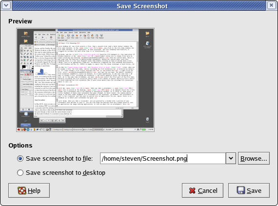
Smart Screenshots

In Mac OS X, when you take a screenshot, a PDF file is placed on the desktop. PDF is an awkward choice for a file format for a screenshot and if the desktop is obscured by windows, as it often is, then there is little feedback of where your screenshot has gone (though, to their credit, the camera-shutter sound is the best audio feedback of a screenshot on any platform). In Windows, the screenshot is sent to the clipboard, and then must be pasted into an application for use. Again, there is no feedback as to where your screenshot has gone.

Gnome Screenshot Window
View Full Size Image

In Gnome, when you take a screenshot, you are greeted by a window with a preview of your screenshot with options to save it. You can also drag the preview from this window directly into an application (an image editing application, or into an email for an attachment). Nice.

Don’t Tie My Hands

Using Windows Media Player, it is quite difficult to get a screenshot of a playing DVD. If you take a screenshot while a DVD is playing, you’ll see a big empty black box where the movie should be. In order to overcome this issues, Totem, the movie player I’m using on Linux (which is a great, simple, media player – something that doesn’t seem to exist on Windows) there is a tool built in to take screenshots of a playing movie. Under the “Edit” menu, select “Take Screenshot”, and you’ll be presented with a window much like the nice Gnome screenshot window with options to save the screenshot.

Pearl Jam DVD Screenshot
A screenshot from a Pearl Jam concert DVD taken by the Totem, the Gnome media player

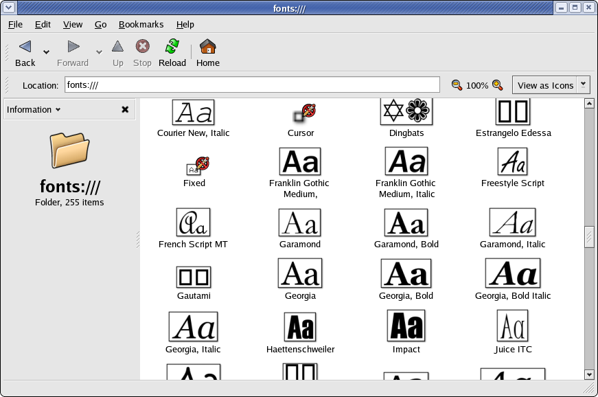
Who said fonts aren’t good in Linux?

While browsing font files (TrueType, OpenType, etc.) in Nautilus, the file icons are replaced with a small preview of the font. Very handy when you’re browsing for a particular font.

Font Previews in Nautilus
Font Previews in Nautilus: View Full Screenshot

Zooming Files

Zoom Controls in NautilusNautilus, the Gnome file manager includes a few simple but powerful tools, always visible. On any window, you can easily zoom in or out, showing more or less information about the files in the folder. For example, if you zoom in, it will show you the file size, but if you zoom out, only the file name is shown. Since Nautilus does a great job of showing thumbnails of image files, zooming in and out in a folder full of photos is particularly useful (this also applies to the font previews mentioned above).

Now when I’m browing files, especially image files, on either Windows XP or Mac OS X, I find myself looking for the zoom controls – a good sign that Nautilus does it right.

Take the good with the bad: Looking forward to a GUI that’s more gooey.

The single greatest weakness I see in using Linux as a desktop is difficult to articulate: the “feel” of the graphics just isn’t there yet. This includes the smoothness and speed with which menus open, windows are moved, etc. Don’t get me wrong, Gnome is easily on par with Windows XP as far as graphics and visual on my laptop (a relatively new P4/2Ghz/1GB-RAM). It’s Mac OS X that has taken a leap forward in this area. The PDF and OpenGL based graphics rendering in Mac OS X gives an overall feel of speed, powerful, and stability that makes Windows and Linux feel like they’re made of paper mache in comparison.

As with most problems on Linux, lots of smart people are working on it. I’m looking forward to progress in the next year in the X windowing system that Gnome uses. Also, I understand the 2.6 Linux kernel, which I’ll be upgrading to soon (I’m running 2.4 right now) offers significant improvements in user interface response times.


I don’t need more flashing lights in my life right now

I just came back from a grand tour of all establishments (that I know of) here in Charlottetown that sell car CD players. My sigfinicant other recently bought a used Toyota with a dud CD player. We like the factory default — it’s simple, it has a volume knob, it doesn’t light up live a rave/disco/acid-flashback.

As it turns out, factory default car CD players seem to be the only ones available that aren’t totally X-treme®!

I’m having a similar problem with replacing my cell phone. It seems that color screens on cell phones do two things (and only two things, as far as I can tell): 1) suck up the battery faster, and 2) obscure system icons with crappy photo-realistic but unintelligible icons.

Anyone who has tried to buy sneakers in the last few years knows that unless you are a go-go dancer from Mars, a mountain climber, or some kind of space athelete, there are no shoes for you.

I can understand that “dudes” want to buy wacky stereos for their dude-mobiles. I also understand that flashy lights might help sell products when they are sitting next to a bunch of others on a store shelf. However, is there not a market for simple and elegant user interfaces? I am not asking for much — from the last I’ve seen, Chrysler, Toyota, Honda, Subaru, etc, all have relatively simple factory default stereos. Why can’t we buy these after-market?

Are substance, value, and usability — factors that come into play after the purchase, not during or before — always going to be drowned out by flash and featuritis — which make their impression at the time of purchase, but let you down afterwards? Of course, I dont’t mind that these wacky products are out there — I just wish I could still get something simpler.

I don’t need more flashing lights in my life right now.

(by the way, if anyone knows where you can buy a used factory default toyota CD player in Charlottetown, please let me know)


Why we need the web

The web browser and the technologies that live inside it (primarily HTML/CSS but also JavaScript and the server side scripts that power web applications) have many limitations when compared to “real” applications. When I say “real applications”, I mean an application that runs outside of a web browser on your own computer (a Win32 app, OS X app, Java app, etc.).

These “real” applications can take advantage of the power of your local computer to provide better user interface toolkits and interactivity. They can also store data locally. This makes great sense for applications like email, newsgroups, mailing lists, RSS reading, or media distribution, like Apple’s iTunes Store (which is more like a hybrid web/real app, to be fair). These applications don’t have to have clunky user interfaces built in the limited world of HTML.

Why, then, do we use the web for so many of these activities rather than these custom applications. Web-based email is becoming as popular as traditional email clients. Many people still browse web news and weblogs rather than use RSS readers, Google Groups has taken newsgroups onto the web, and most mailing lists now have web-based archives.

Why? The simple power of the hyperlink. You can’t link to a newsgroup posting in a newsgroup application. You can’t link to an item in an RSS feed. You can’t link to an email on a mailing list.

This key feature is so important that it is often worth living in the limited world of the web-based interface just to keep the ability to link to the things we create.

You can, though, have the best of both worlds. RSS is the prime example of this. RSS readers give you all the benefits of being real native/local application, but the content they serve is all available through a normal web-browser — where it can be linked to. This is why, even if everyone one eventually reads our weblogs via RSS, we still need the HTML-based version.

Most mailing lists also do this well. Most interaction (reading and posting) is done through a traditional email client). However, a web archive gives you a place to link to when discussion older posts.

We need the web. Other applications are complimentary — not replacements.


The Mysterious Zoom Button of Mac OS X

I generally enjoy the simplicity of the window controls in Mac OS X — especially with the subtle visual simplifications in version 10.3.

While Windows (and the common linux GUIs, Gnome and KDE) have the common three window controls (minimize, maximize/restore, and close), they also have another menu on the top-right of the window. This includes these same window controls again, with some additions (I’ve debated removing this extra menu in Gnome).

Mac OS X dispenses with this second title bar control, simplifying the typical window to great effect. To be fair, though, it does get to hide some of that functionality in the common application menu at the top of the screen.

Mac OS X toolbar controlHowever, there are two things that do bother me about the OS X window controls. The first is somewhat trivial and subjective. I don’t think the “show/hide toolbar” control warrants such a prominent position on the title bar. It is handy, on occasion, but shouldn’t a control to hide/show a toolbar be somehow connected to the toolbar? Is this even something that needs an always-visible control?

My second peeve is one that dates way back to the days of the Classic Mac OS. Perhaps some sage Mac users can clear this up for us. What’s the deal with that zoom control?!

Mac OS X toolbar control
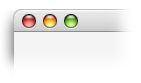
The little green orb (it includes a plus symbol + when the mouse hovers over it) has always confounded me as to what it will do each time I click on it. It has become known around my office as the “green random window size changing button”. Apple calls it the “zoom button” (they always have been good at naming things).

According to Apple, the zoom button toggles the window between the “user state” and the “standard state”:

The user state is the window size and location established by the user. If your application does not supply an initial user state, the user state is simply the size and location of the window when it was created, until the user resizes it.

The standard state is the window size and location that your application considers most convenient, considering the function of the document and the screen space available. In a word-processing application, for example, a standard-state window might show a full page, if possible, or a page of full width and as much length as fits on the screen. If the user changes the page size through Page Setup, the application might adjust the standard state to reflect the new page size. If your application does not define a standard state, the Window Manager automatically sets the standard state to the entire gray region on the main screen, minus a three-pixel border on all sides. (See Macintosh Human Interface Guidelines for a detailed description of how your application determines where to open and zoom windows.) The user cannot change a window’s standard state.

However, it seems more common that an application opens up for the first time at an appropriate and comfortable size (as recommended by the Apple Human Interface Guidelines). Then, when the “zoom button” is clicked, the window effectively “maximizes”. OS X doesn’t have the full “maximized” state that Windows uses (a reasonable simplification for which I do not fault them — and it is a nice removable of a “mode”). Rather, the windows seem to just get as large as they can. However, this seems quite inconsistent — sometimes they will take up the full width, but keep the same height — others seem to maximize both height and width.

The end result of this is that I end up not knowing what to expect when I click the zoom button. So, I usually don’t click it at all.

So, I ask of you, the sage readership:

  1. What exactly does the zoom button do?
  2. If there is a reasonable answer, then how can this be made more obvious, as to avoid my current state of confusion and frustration?
 

The Beauty of the Default

When those of us who live on our computers setup a new one – there is usually process of redecoration and customization. This process usually takes a few days, with a few little issues hanging around for a week or two. We install of our applications, we customize window and color settings, we set our desktop background color or image.

While I do all of these things, to varying degrees, I have a love for the default settings and strive to use them, and improve them, whenever possible. There is something to be said for keeping things are they are by default, regardless of the customization options.

First of all, it is easier – if you use the default settings, things are already setup for you! It also makes working between various computers easier.

Default settings are more important than any customization options that may live behind them. For example, the Mozilla web browser had tab-browsing functionality for years and I never touched it – when I did, I always changed the settings to open tabs in the background, and to open tabs with Ctrl+click. However, I could never remember if I had set these options since I had last installed or upgraded (something that happened quite frequently, since I was following the development of Mozilla).

Then, when the Firebird web browser came along, tab-browsing had both of these options enabled by default. All of the sudden I can’t live without tab-browsing. There were no new settings – only a seemingly subtle change in which settings were chosen by default.

I’ve been encouraged to see that open-source software developers seem to be gaining an appreciation for the importance of good defaults. While open-source developement has often been criticized for bogging applications down with too many options (and this has certainly been a problem), I’ve seen a great respect to simplicity in configuration options, and the importance of good default settings by the managers of the Gnome project, Nautilus, Gaim, and Mozilla Firebird.

Long live good defaults!


DeltaTangoBravo.com? Roger that.

Though I’m usually glad to take most of the credit, much of my professional and personal design work is often the better for having been subject to collaboration and criticism from my co-workers.

After much teasing/coaxing/punching, my professional better half at silverorange, Daniel Burka, has finally joined the world of weblogs. His site, DeltaTangoBravo.com just went up this morning and already busting with coolness. Fans of the silverorange design aesthetic (if there is such a thing) will recognize Daniel’s signature style.

So far, he has pointed to an amazing set of Tufte-esque illustrations (beautiful) and regaled us with the sad tale of putting his new digital camera through the washer (and dryer).

Welcome to Daniel, and to those who enjoy all things smart and good, get over there and syndicate that thing.