 Back in October of 2003, I wrote an article with a series of criticisms and recommendations for the branding and visual identity of the Mozilla software projects. Partially, I suspect, due to my cheap and somewhat inaccurate use of the “2.0” version in the title of the article, it got quite a bit of attention. There was a Slashdot article about it, with loads of Slashdot-esque replies.
In open source software development, the usual reply to any requests, suggestions, or criticisms is the classic refrain: “Where’s the patch!?” This reply is a (sometimes) polite way of saying, if you don’t like it, fix it. That’s how open source software development works. Therein lies its beauty.
Since the recommendations in my article were not the kind of things that can be fixed with a software patch, I got the graphic design equivalent of a “where’s the patch” response. Bart Decrem from the Mozilla Foundation contacted me and asked if I would be interested in helping out with the branding work (i.e. “where’s the patch!?”). A few months later, I’m the lead of the Mozilla Visual Identity Team.
Our tasks is to improve the quality and consistency of the visual elements of the Mozilla products. Icons/logos, default themes, and other visual aspects of the software are all on our radar.
The team includes two of my co-workers at silverorange, Daniel Burka and Stephen DesRoches as well as other volunteers from a bunch of different time zones. Kevin Gerich and Steven Horlander have done the Mac OS X themes for Firefox and (soon) Thunderbird. They’re also working with Daniel on the default them on other platforms.
Our first major piece of work was to create a new logo and icon set for the Firefox browser, which was newly renamed (formerly Firebird).
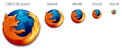
Jon Hicks did the illustration of what is now the new Firefox logo and icon. The form was based on an idea by Daniel Burka, and a sketch by Stephen Desroches. Other icons in a similar style will follow for Thunderbird and other appropriate locations.
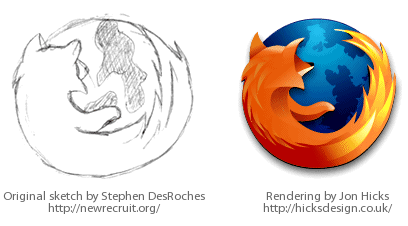
Jon has made a great post about the design process on his weblog. I stole a few of the graphics from his post — thanks/sorry Jon!
 I asked Joh Hicks to help out after having seen the custom icons he did for Camino based on The Great Wave by Katsushika Hokusai. This is possibly the best icon/icon-set I’ve ever seen — it is a work of art. We’re lucky to have Jon working on the visuals with us (thanks Jon!).
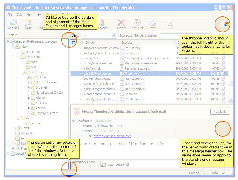
Such is the open source world; when a developer looks at something that they don’t like in an application, they fix it (or try). Those of us who are picky about visual and user-interface consistency and polish are looking at the Mozilla applications, and fixing what we don’t like.
There is something truuly significant about the way I was able to go from user and critic, to participant and contributor. I would like to see the same thing in politics and other spheres of life. If you don’t like how something is done, and think you can help improve it, then get involved. Don’t expect someone else to do it.
The Mozilla Visual Identity team is only getting started too. Look for the Mozilla applications, especially Firefox and Thunderbird to get better, slicker, smoother, etc. Thanks to everyone on the team for their great work.


