Google has a new favicon. If you don’t know what a favicon is, rather than explain it, I’ll suggest that you probably won’t care about the rest of this post.
If you’re still with me, the new favicon is notable because the old one was a small but ubiquitous sign-post on the web. What I find more interesting, though, is a particular aspect of the implementation.
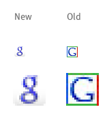
The new favicon is a full RGBA color icon file with alpha transparency. What makes this noteworthy is that the this type of icon isn’t supported in Internet Explorer, still the dominant browser on the web.
Is Google intentionally leaving Internet Explorer behind on this visible, but admittedly trivial, part of their website? Or, is this an oversight (or part of an incomplete change)?
Either way, it doesn’t sound much like Google.
UPDATE: I was wrong about this. It is supported by IE – see my comment for a bit more detail.
I noticed the change myself a few days ago. However, the new ‘g’ does show up in the url area of IE7. It also gets used in your favorites list if you bookmark a Google page. Is this what you meant or were you referring to some aspect of the alpha layer?
When are we going to get a new episode of AOV Radio? I’m getting the D.T. shakes, man.
it’s ok but it’s far from readable with the great Darklooks theme on gnome
Also in the unreadable category you have the “Preview” and “Post >>” buttons of this page.. 😉
David
Will, thanks for the reply. I’ve done more testing an it seems the main point of my post is based on a mistake on my part.
It turns out Internet Explorer does indeed display this icon. I made my conclusion based on some bad testing on my end. Though it didn’t help that if you go directly to the favicon file (http://www.google.com/favicon.ico), Internet Explorer does seem to have display problems.
So, my mistake. Move along.
The new one is terrible because it’s indistinct, and the alpha makes it worse. When it sits on the gray background of an inactive browser tab it’s almost invisible. I posted a pic here: http://nathanbowers.com/design/why-the-new-google-favicon-sucks/
Yeah, I hate to nitpick such a small thing but the navy blue lowercase g doesn’t fit with Google’s bright and slightly retarded image in my mind and stands out less amongst my Firefox tabs.
Ultimately I doubt it’ll matter in the long term and I’m sure I’ll adjust. I’d just love to know the design logic behind it.
Am I the last person to learn that RGB/A favicons work in Internet Explorer 6 (XP only)?
Everything I know is wrong.
Hi,it is too high for a newcomer like me.
You were wrong in the second sentence too.
asdf sa asdf asdf asdf asdf asdf