I resisted my well known irrational urge to upgrade as long as I could, but this weekend I gave in and installed Windows XP. A good rule of thumb: never upgrade your operating system simply because you are bored.
My initial reaction is that the fancy UI effects make things feel a little sluggish, but there are some very interesting improvements as well (and the visual effects can all be turned off). What struck me most about the new visual style in XP is that it is full of little glitches and holes. None are particularly significant, and this may seem nitpicky, but as Blink 182 puts it so well, it’s All the Small Things.
Behold some stupid little things that I couldn’t help but notice and criticize.
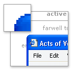
Icons Old and New
 First, the icons – most are new and beautiful. However, this makes the new that are neither new nor beautiful all the more jarring.
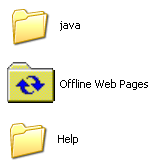
You’ll see ugly old icons like this all over the place, but most are from old, non-microsoft programs. That’s understandable. This left over icon for Offline Web Pages is just weird. I don’t understand – did they forget it?
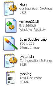 Even within the icons that were clearly designed for XP, there are odd inconsistencies. As you can see here, there are both icons with an angled perspective, and traditional rectangular icons. Not sure why.
In addition to that, notice how the two rectangular icons (vmmred32.dll and Soab Bubble.bmp) don’t even line up.
The end result of all this is a really wacky looking screen full of waggling icons.
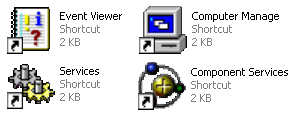
The worst offender in terms of icons is in the administrator components of XP. Did they think the pretty new icons would frighten techies? (not a totally unreasonable fear, mind you). These are some of the icons from the admin section of the otherwise beautiful Control Panel.
Rough Around the Edges – Literally
 This next point may seem to cross the line into obsessive, but I with all the other eye candy going on (alpha blending fading menu shadows, etc.) it’s a fair point. If they can smooth the edges of your fonts, why can’t they smooth out the corners of the windows? Perhaps there are good reasons for this – and I concede that this is getting to be a little too nitpicky – but I still noticed it.
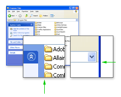
Give Your Pretty Widgets Room to Breathe
I also noticed several places throughout the UI that looked like they needed a little room to breath. Spacing and padding are critical to a comfortable looking layout. Notice the areas pointed out by the green arrows.
Innie or an Outie?
While the subtle gradients and shadows used throughout the UI are generally well implemented, there are a few areas that confuse the eye. Note the shadows in the top and bottom of this small window pointed out by the right green arrows. When the eye has trouble discerning depth (is that a rise or a depression?) it can be visually disruptive.
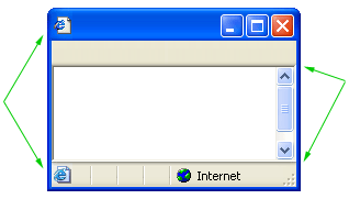
Also, notice what appears to be two versions of the same icon in the image above (by left green arrows).
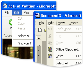
Oh, I see, Office XP
The next two images are not specific to Windows XP, but to inconsistencies between Microsoft’s Office XP and the rest Windows XP. Notice the two different menu styles: the Windows XP default on the left, and Office XP on the right.
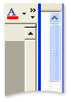 Another odd discrepancy between Office XP and Windows XP – the scroll bars. For some reason, Office XP doesn’t use the new XP scroll bars. Holy 1995.
Having trouble following the rules in-house can make it all the more difficult to police other developers.
Buying Music Isn’t Hard to Do
My final criticism is not visual. In fact, it looks great. Trouble is, it smacks of the overwhelming advertising tactics of RealPlayer. While browsing folders, there are panes with common commands on the left of the window. For the most part, they are quite handy and intuitive. However, when you are browsing a music folder, the following ‘helpful’ option shows up.

Final Thoughts and Compliments
You’ll also occasionally catch a glimpse of the scaffolding behind this pretty OS. When opening a new window, or expanding a new tree in the start menu, if your computer is working at something else you’ll often see the old Win2k grey before the pretty new colors load in. This only happens for a split second, but it undermines the feeling of stability (which can be just as important as actually stability in terms of customer satisfaction).
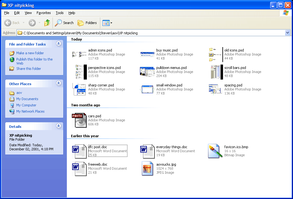
Despite all of this criticism, I am generally pleased with XP so far. The ‘Thumbnail’ view for images is more refined and much faster than in Win2k. Also, the sorting and grouping options for files and folders are simple, but quite handy. For example, you can group a folder of images by file size or actual image dimensions.
If you have a folder with 3000 images, a third of which are thumbnail, another third large images, and the rest icons, sorting by dimensions is fantastic. See an example grouping by date. For someone who deals with a lot of images, these features are a nice touch.
These points are mostly quite trivial on their own. Together, though, they can undermine with feeling of stability and consistency of the system.
More thoughts as they come to me.
One of the nice new features I am enjoying so far in XP is the new Windows Update for XP. It’s much faster than the old version and ties into the OS nicely with download in the backround features.
My first thoughts when I looked at XP for the first time were:
1. “Dude, it looks like some kid ate a box of crayons and vomited on this screen!”
2. “Stupid Microsoft. Do they think that users are complete idiots? This looks like a Disney program!”
3. “Well, I guess most users don’t really understand computers, and apparently this makes it easier, so it’s fine. I guess.”
Good analysis, Steve. Very thorough. Nitpicking? That’s your godgiving right! You’re paying for this stuff! Over here in Mac land isn’t much better. Check out OS X. There’s no treasure under that X. It’s the first time in the fifteen years, I am truly ashamed to be a Mac user. (Supposedly the GUI gurus) The interface designers of OX Ecchs should be dragged out on the street , drawn and quartered by horses. Check it out. Putrid! I’m still using 9 as long as I can.
Great piece, Steven. Thank you.
Sandy, what’s so horrible about OSX? It’s certainly flawed, but “putrid”?
Steven, I think you should give OSX the same treatment as XP. I’m very curious what you’d come up with. To my eye, OSX is most certainly lovely and XP looks hopelessly second-rate in comparison. The usability of OSX is another issue, of course.
Kirby, it’s a matter of personal taste, really. I feel the whole ‘photographic’ icon/feel defeats what Mac has maintained up til X, which is pure graphic design, serving its purpose as icons on a screen should do, to communicate function. I find the OS X interface putrid, because it goes against my personal belief that visual language is best done simply and graphically, with minimal destraction. An photographic icons are visually insulting to Mac users, because (to me) it reflects a ‘dumbing down’ towards the user. I know I’m alittle oversensitive about this…I believe that excellent graphic design (at its best) is an unseen art . I, too would like to hear Stevens take on OS X
Sandy, I agree with your points about icons. As I’ve said before, they should be simple and generic, specific in photographic detail.
Read Designing Visual Interfaces and you can pretend to be smart like me too (great book).
As for the subjecting question of visual style, I’ll let your wierd mac users fight it out.
Smart is as smart does, Steven. As for visual style, that is not a ‘weird mac user’ thing… its a ‘weird designer thing’.
I have been using IBM PCs for 19 years, starting from the first version of MS-DOS and culminating in Windows 2000 (I like the look of Windows XP, but will not buy into Microsoft’s draconian registration process, so will not upgrade). I recently purchased an iBook, running Mac OS X and I consider it the most sensible, highly-evolved, aesthetically pleasing user interface to a computer that I’ve ever used. It is the only UI I’ve ever used which is remotely intuitive. I guess, for me, it hit a UI sweet spot. To each their own.
My favourite Mac OS X + iBook feature: fire up iTunes, connect to a web radio station. Listen. Now close the lid of the iBook. iBook goes to sleep. Wait. Now open lid. Web radio station (and, for that matter, the rest of the OS) starts instantly. No “hold on while I try and figure out what sort of computer I am and what I was doing before and refresh the registry and redraw the screen and connect to Microsoft and see if I’m properly licensed, etc.” delay that I’m all too used to.
-Peter
Although I’ve been generally pleased with XP over the past few weeks, I have a few more nitpicks.
I’ll complain until they fix it.
Form controls (buttons, checkboxes, radio buttons, etc.) in Internet Explorer 6 use the new Windows XP. That’s a good thing. However, if a button stretches beyond a certain width (not even particularly wide), it stretches in an ugly and rough manner, rather than scaling elegantly as it should.
The curious design issue annoying me most is the font colouring on desktop icons. If you choose a black background, the words will turn white, and vice versa. But should you use a light background image, like ‘Peace’, it will use white text surrounded by an ugly black aura. I’m sure that even Windows 95 handled this better.
Guy, you can download an enhancement for Windows that will allow you to make the “ugly black aura” transparent if you so desire.
Actually, i think this is a setting hidden in one of the two places you can set your visual preferences. Not sure which one it is, but i know if you max out everything visually, those halo’s go away.
Oh and windows XP is the first to handle this nicely – 2000 would show the halos.
I’ve seen the feature you guys are talking about in screenshots like this one before. However, after a bit of searching, I was unable to find it on my machine.
Steven — control panel -> system -> advanced -> performance — this dialog allows you to change many UI options, including this one.
Cam, thanks. With your instruction, I found the feature. However, it doesn’t seem to do anything. Whether it’s checked or not, I still get the box around desktop icon titles. Is it just me?
When I turn on shadows under the text of my desktop icons, then the coloured square which otherwise surrounds them is removed.
Thanks for the tip Cam. What an obscure place to bury all those settings! I was kind of hoping it would make an intelligent choice on black or white label text, based on the shade of the background image, but I guess the coloured boxes are a good alternative.
Microsoft’s MSDN section devotes a page for the Windows XP icon style guide. It did note that document icons, symbol icons, and single object icons would work best without the perspective angle.
Another reason for the inconsistent icons is that Microsoft outsources the icons to the popular Mac icon designers Iconfactory. This might explain why they didn’t finish every single icon.
I have to say that you’ve hit the nail on the head regarding the inconsistencies in XP. When we worked with Microsoft to develop the icon suite for the new OS, we were given a list of every icon they wanted us to design and produce. Over the course of the 8 month project, that list changed more times than I can count. It is not surprising in the least that icons were either A) overlooked or B) deemed to be updated in the next rev of Windows.
When we finished our part of the design and production, we knew there were more icons that needed to be updated, but Microsoft said they would take care of those themselves. Many of the inconsistencies you see in the OS as far as angles (when an icon is in perspective vs when it is not) is directly due to Microsoft and the set of visual “rules” they set up for themselves (or chose to ignore… however you want to look at it). The vb.ini icon you mention in your article is a great example of this. This is an icon that Microsoft did itself after they said The Iconfactory was finished. I would dare say you can actually tell we didn’t create it. Its visually different from the rest, and the perspective “rule of thumb” isn’t’ followed.
Hope this all helps give you a little piece of mind.
Nice topic.
Concerning “Give Your Pretty Widgets Room to Breathe”..
in Win2000 you can edit and custemize the file named “folder.htt” (it’s in your [drive]:/WINNT/Web folder) which describes (in HTML) the right plane, detailed view. I’m sure this is the same in WinXP.
Excellent article. Interesting that you point out the difference between Office XP and Windows XP, too. At work, we’re currently deciding whether our next generation of apps should follow the Office look or the OS look. As far as I recall, the Office team within Microsoft has got the biggest UI-dedicated group in the company and pushes ahead a lot more than the OS team. It would be nice if they could just coordinate their efforts for once, though.
I personally think the bash shell has
the best interface. Who needs a mouse? Plus if you ever get tired of the UI in OSX then it’s right there! Anyway, man pages give you more info than every help file on every windows machine in the whole world put together.
Having done a fresh installation of XP after tearfully parting with Win2K…and then coming back to Win2K ..having realized that XP is just Win2K gone wrong… I have only 1 thing to say.. XP SUCKS
If you are unhappy with the icons and window styles of XP, then I’d suggest purchasing a wonderful set of programs from Stardock.com called Object Desktop. At http://www.wincustomize.com there are literally thousands of different styles for Windows (XP works best). The two programs that would probably interest you the most are Windowblinds (which changes the “skin” of the window borders and start menu) and IconPackager (which lets you downloads packages of Icon and replace all of your system icons at once). It’s worth a look!
Ears are neat. XP is not.
If there is nothing in XP that you can’t get along without, why not make the move to Linux? The only thing that keeps me using Microsoft at all is that there are some apps I need that haven’t been ported to the Linux world. Otherwise, I would be 100% Linux, instead of the 60-40 I am now. Linux is faster, much more configurable, and doesn’t have XP’s ‘cartoonish’ look. And best of all, its free!
I’m all for high-end design in a UI but what is with all the Gel? The Iconfactory has done some brilliant work with XP and OSX icons – here the ‘gel’ style is used to good effect but it’s spreading everywhere; gel buttons on requesters, gel scrollbars, and stupid red/amber/green gel icons for closing/minimising/maximising. Taken as a whole, the end result of this gel invasion is that my PC looks dated locked into ‘classic’ mode, and my Mac looks like someone’s poured half a kilo of jellybeans into my system. There’s no middle ground. Give me a UI with anti-aliased text and alpha transparency. Make it look neat and uncluttered. Just dont fill it with jam, jelly or any other goo. And dont bother making windows contort when minimising – it just looks silly.
Moo: Good points. I would like to put Edward Tufte next to some of these UI designers (see Tufte’s thoughts on OS X).
Quick note on OS X, you’re not getting Bash by default (although it’s there) rather the BSD users favourite of CSH is your shell friend.
Well I used to use windows. I have used it for many years. Then I switched to the mac OS. If you sad people rekon that windows is user friendly, try os10.2 on the mac.
It is all anti-aliased, runs faster and smoother than windows and is more enjoyable overall to use.
I have to still use windows machines at work, so i get the best of one world (my home mac) and the poor bum world (windows).
And whats with this latest virus? you dont see us MAC users getting affected, eh?
Moo, if you don’t like the default interface in OS X, try using one of the many skinning applications that are available. I personally like Duality (http://www.conundrumsoft.com/newduality/), but there are plenty to choose from. I like the simple QNX theme (http://homepage.mac.com/max_08/) from this guy Max. He has quite a few others that may suit your fancy.
Don’t let Aqua’s annoying striped menus keep you from enjoying the full anti-aliasing and dynamic motion of OS X!
Steven, great article. I had no idea until now that Iconfactory was behind the Windows XP icons, although had I been challeneged to think about it I may have come to that conclusion. As someone once charged with developing a set of icons for a product, (that was regrettably canned) I know how hard it is to do, and also how important it is to do right. Especially for a product like Windows.
Hey, I want to see windows xp for myself. So could
you please copy it into a .zip file from the CD,
and put it as a download link on this webpage?
Then when you have done that send this webpage as a
link to my email adress and tell me in the e-mail?
Be a good pal and do that.
Great article, Steven – fascinating stuff. But for me, like most medium-level users, it comes down to: “Does it screw up or not?”. I’ve been using XP on my home desktop and my laptop for about eight months. Initially, I was severely pissed about what seemed to me to be purposeful incompatibility with all my existing programs, the whole “Let’s squeeze the last few dimes out of the galaxy” mentality that seems to permeate Microsoft’s every action.
I’ve either worked around, worked through, or patched up solutions to most of those – truth is, most of us have more programs on our puters than we use. But lately I’m getting some bugginess around my browsing and hotmail, and it’s got me suspicious. Not sure who to blame – MSN, Windowns XP, Eastlink, or Sony Viao … but when I find out, I will shower wrath down upon them.
Mostly, though, it’s been OK … so far.
Every new machine that I assemble and load XP on to, I go to the performance settings and revert everything back to a more Win2k look. I like it more that way. As far as shading and depth inconsistancies, I kind of like the look… sometimes. I do quite a bit of photoshop and use that almost as a tool, when done right, and I rarely get it right, it can look real cool. In this case, it could be better but I overall like it.
If anyone at IconFactory or anyone who designs icons and know how to skin an XP still reads this, perhaps you can release a “Missing XP Icons” set…
One of the first things I turn off after installing Office 2000 is that idiotic default of hiding most of the menu commands until I hit the little chevron-style arrow.
Unfortunately, Win XP is now doing that to my Programs section of the Start menu and I can’t find the way to show me all my programs.
I want to get to the program I need and this useless extra step is an annoying tme waster.
Any ideas?
Wookiee, I’m guessing you’re set your start menu in “Classic Start Menu” mode, right? If so, right click the Start button, make sure you’re in the “Start Menu” tab, and click the “Customize” button next to “Classic Start Menu.”
In the bottom of that dialog, there is a section called “Advanced Start Menu Options.” Scroll to the bottom of the selections in that box and uncheck the “Use Personalized Menus” option.
There! Wasn’t that fun?
Thanks Wes! That did the trick!
As a programmer who uses Microsoft products for my work I should have guessed they’d put it in a non-intuitive command. I would have thought “User Personalized menus” would mean it allows you to personalize your menus, not mean “hide/don’t hide my programs”.
Sheesh.
Thanks again.
You have yet to learn the dictum central to Microsoft — we know better than you! 🙂
“Why would we let the user personalize the menu, when he could possibly do something that would confuse us? Best we do the personalization ourselves. Just look at the pretty clouds. Nothing to see here.”
good to know there are people in the world who like to criticise microsofts consumers skemes, someone needs to make a windows gui but not microsoft based
I use Win2k at work and WinXP at home. must say that windows 2000 does feel more stable (although the pc i run it on isnt)
I think also there are quite a few versions of windows XP Pro, the first time i installed it, i but the classic mode on (Win2k look) and it worked fine….. i just reinstalled it (from another CD) and am having major problems with it now!
The reason why there are hard edges in the rounded edges in Luna, and this happens in ANY theme on windows until longhorn comes out. Is the way that XP2k handles alpha transparency. Where an entire window is put into overlay and transperized like that. So… in order to get a window with independent transparent windows you actually have to group seperate windows together. That’s what samurize, and desktopX do. MacOSX puts a 32-bit mask on everything so it’s able to do independent transparent stuff.
Themes use magic pink to designate whether a pixel is on, or off inside a border.
Linux doesn’t fix this problem either afaik, there is no WM with 32-bit borders.
Independent transparent elements that is, such as borders apart from the window. Buttons and checkboxes are a different story as they are on top of a dialog area.
I find XP Pro in it’s default setup nearly unusable. That damn annoying start menu !
Like others, I revert back to ‘classic’ style, turn off all the shadowing and animation. Then it’s like a ‘slightly prettier, but less stable Windows 2000’ – gee…I even set my XP desktop to the same backround ‘blue’ (65 110 165) as Windows 2000. It almost makes it look like ‘real’ workstation again. I always Macify my windows icons (place on right, work cascading windows from upper left corner down and over towards the right). I even put my Recycle Bin down in the lower right corner above the systray – I owned an original 128K Mac…gee, how could you tell..
And when I tire of that, it’s ‘back to Slack’ (Slackware) and a minimalist Fluxbox (that’s redundant I guess) for real work. Desktop switching via wheelmouse – brilliant ! No matter how nice XP gets, I can’t live without desktop switching – that feature (nearly) alone sells me on GNU/Linux. I can’t stand minimizing (or even shading) windows. All those extra clicks !
For now, on GNU/Linux, I steer clear of the DE (desktop environ – GNOME vs KDE) debate. Speedy, small, efficient WMs are good for me (but I realize, not for all) for now. Recent GNOME screenshots are starting to look tasty though !
> No matter how nice XP gets, I can’t live without desktop
> switching – that feature (nearly) alone sells me on
> GNU/Linux. I can’t stand minimizing (or even shading)
> windows. All those extra clicks !
Try deskman.exe from the Microsoft PowerToys for Windows XP package. This desk switching hack doesn’t work as elegantly as under UNIX (its slow when you have a lot of windows), but its better than nothing:
http://www.microsoft.com/windowsxp/pro/downloads/powertoys.asp
— Marcio
There are tons of ways to get virtual desktops on windows, there are many freewareshareware virtual desktops. Plus shells that have virtual desktop plugins like Litestep. You can even set hotkeysmousewheelwhatever to switch desktops.
P.S. I don’t think a computer has to look boring to be usefull.
Roo maybe you should look into an OS like Linux, true windows may have more viruses than Mac but if my knowledge is correct, i believe there has only ever been ONE virus ever written for Linux.As a WinXP user i will agree that i don’t like it and predominatly will admitt the best and safest is Win98SE. I am however planing on switching to Linux once i get a new computer. I have used Gentoo with a KDE GUI and it was exceptionally better than Windows. But i need to start with an easier to use and edit one Mandrake or RedHat for example.Although i’ve only used Mac in stores (computers on display) i have never really explored one much but from what i’ve seen i don’t like the look of it at all, being a Windows user i find Mac abit confusing maybe if i tried it out i would think other wise but from what i’ve seen and done with one i don’t like it one bit.
I want to now the five DOS commands whose functionalities have been ported over and enhanced in Windows XP.Please respond urgently
fuat git kendini camdan aşağı at.. bak bakalım uçabiliyo musun..
boşu boşuna 2 dakikamı çaldın benim… saçma saçma şeyler, ne bu böyle adamın işi gücü yokmuş da bunları mı yazmış, ohooo
en iyisi sen bırak bu işleri..
Dağılın lan mına koduklarım!!!!!
Sana mı kaldı bil geytsi eleştirmek mına goduum. Yapmış adam gül gibi ikspiyi yok orası bozuk yok burası bozuk. Sikerim kullanma o zaman amucuk. Git linuz neyin gullan. Penguenler sitsin de kaçacak pencere arayasın, mına koduuuum!